$150 bucks for a logo that doesn't suck ass....

Sidle up to the bar (Lightly Moderated)

Moderator: Dictators in Training

Gaazy
NT Deity
NT Deity
Posts: 5837
Joined: Fri Mar 12, 2004 8:32 am
Location: West by god Virginia

Post by Gaazy »

yes :-x i told him to take it off but he would not :ugh:
User avatar
Phlegm
Nappy Headed Ho
Nappy Headed Ho
Posts: 6258
Joined: Tue Aug 03, 2004 5:50 pm

Post by Phlegm »

Gaazy wrote:yes :-x i told him to take it off but he would not :ugh:


so you guys fused while he was wearing his pirate costume?
Gaazy
NT Deity
NT Deity
Posts: 5837
Joined: Fri Mar 12, 2004 8:32 am
Location: West by god Virginia

Post by Gaazy »

yessir
User avatar
Ouchyfish
NT Patron
NT Patron
Posts: 4744
Joined: Wed Mar 10, 2004 1:57 am

Post by Ouchyfish »

Hatak wrote:Very nicely done, Maeya!
Lyion wrote:If Hillary wins Texas and Ohio, she'll win the nomination.


Tossica wrote:Seriously, there is NO WAY Sony is going to put HD-DVD out of the game.
User avatar
Captain Insano
Nappy Headed Ho
Nappy Headed Ho
Posts: 8368
Joined: Fri Apr 16, 2004 1:04 pm
Location: SoCal

Post by Captain Insano »

Maeya wrote:Poke away :)

Image

Image

Image

Image


I'm extremely impressed. I need to go over these with my biz partner on Monday, but it looks like, with a few modifications, you'll be winning this contest...You're honestly putting a lot of work into this and I think we'll probably be paying you more too.


I need to see one other sample though please.

Can you make the lightning even more of an orange/red and take some of the white out of it?

It comes off a little pinkish almost.

I'm also going to take one of the pictures and make some notes on it for you and repost it. I really like how the "S" is connecting with the U and E... the only thing is that the lining need to be done a little differently. It's lacking a minor amount of fluidity.

The bottom logo with the molten sun looks decent too, but I don't think it was quite was I am looking for.


Can you come up with something for my symbol too? I love the Fuse Computers, but I also need something separate and stand alone from the text...ie: Nike needs its swoosh.

I'm really thinking about some sort of metallic sphere split into four pieces with a glow coming out of it, or some sort of fire. The XBox logo is kind of what I was thinking....If you can think of something better I am all about it.

Thanks and great work! I'll post more on Monday when I have time to talk to the staff.
Tossica: No, you're gay because you suck on cocks.

Darcler:
Get rid of the pictures of the goofy looking white guy. That opens two right there.

Mazzletoffarado: That's me fucktard
Vivalicious wrote:Lots of females don't want you to put your penis in their mouths. Some prefer it in their ass.
User avatar
10sun
NT Drunkard
NT Drunkard
Posts: 9861
Joined: Sat Mar 13, 2004 10:22 am
Location: Westwood, California
Contact:

Post by 10sun »

Do an exploding barrel!

People would remember and recognize that logo.
Maeya
NT Veteran
NT Veteran
Posts: 1309
Joined: Thu Mar 11, 2004 6:56 am

Post by Maeya »

Can you make the lightning even more of an orange/red and take some of the white out of it?


Which one? The one with the lightening all over it? Or just in the "U"?

Can you come up with something for my symbol too? I love the Fuse Computers, but I also need something separate and stand alone from the text...ie: Nike needs its swoosh.


Will give it my best.
User avatar
Captain Insano
Nappy Headed Ho
Nappy Headed Ho
Posts: 8368
Joined: Fri Apr 16, 2004 1:04 pm
Location: SoCal

Post by Captain Insano »

Maeya wrote:
Can you make the lightning even more of an orange/red and take some of the white out of it?


Which one? The one with the lightening all over it? Or just in the "U"?

Can you come up with something for my symbol too? I love the Fuse Computers, but I also need something separate and stand alone from the text...ie: Nike needs its swoosh.


Will give it my best.


let me get back to you tomorrow on the first question. I don't want you to do anywork you don't have to. I'm leaning towards the one with just the lightning on the "U", but I want to get some second opinions from the rest of the staff.
Tossica: No, you're gay because you suck on cocks.

Darcler:
Get rid of the pictures of the goofy looking white guy. That opens two right there.

Mazzletoffarado: That's me fucktard
Vivalicious wrote:Lots of females don't want you to put your penis in their mouths. Some prefer it in their ass.
Jay

Post by Jay »

Fuse computers in front of a swastika with the ends of the swastika having sharp points and impaling children and black people.
User avatar
Dylan
NT Patron
NT Patron
Posts: 5229
Joined: Mon Mar 15, 2004 11:11 am
Location: Seattle

Post by Dylan »

Jay wrote:Fuse computers in front of a swastika with the ends of the swastika having sharp points and impaling children and black people.


Seconded.
Tikker
NT Legend
NT Legend
Posts: 14294
Joined: Tue Mar 09, 2004 5:22 pm

Post by Tikker »

for the symbol, I'd do something like this(but better):

Image
User avatar
Dylan
NT Patron
NT Patron
Posts: 5229
Joined: Mon Mar 15, 2004 11:11 am
Location: Seattle

Post by Dylan »

<img src="http://namelesstavern.com/album_page.php?pic_id=296"> Can anything be done with this?
Jay

Post by Jay »

:badlink:
User avatar
Captain Insano
Nappy Headed Ho
Nappy Headed Ho
Posts: 8368
Joined: Fri Apr 16, 2004 1:04 pm
Location: SoCal

Post by Captain Insano »

Dylan wrote:
Jay wrote:Fuse computers in front of a swastika with the ends of the swastika having sharp points and impaling children and black people.


Seconded.


beautiful idea. Thank you both.
Tossica: No, you're gay because you suck on cocks.

Darcler:
Get rid of the pictures of the goofy looking white guy. That opens two right there.

Mazzletoffarado: That's me fucktard
Vivalicious wrote:Lots of females don't want you to put your penis in their mouths. Some prefer it in their ass.
Tikker
NT Legend
NT Legend
Posts: 14294
Joined: Tue Mar 09, 2004 5:22 pm

Post by Tikker »

for some reason, I still haven't received my cheque for $150 :(
Narrock
NT Patron
NT Patron
Posts: 16679
Joined: Mon Mar 15, 2004 11:54 pm
Location: Folsom, CA

Post by Narrock »

Tikker wrote:for some reason, I still haven't received my cheque for $150 :(


That's because you canucks spell everything wrong, like "cheques."
“The more I study science the more I believe in God.” -- Albert Einstein
Tikker
NT Legend
NT Legend
Posts: 14294
Joined: Tue Mar 09, 2004 5:22 pm

Post by Tikker »

yes, the rest of the world spells it wrong
Narrock
NT Patron
NT Patron
Posts: 16679
Joined: Mon Mar 15, 2004 11:54 pm
Location: Folsom, CA

Post by Narrock »

Tikker wrote:yes, the rest of the world spells it wrong
“The more I study science the more I believe in God.” -- Albert Einstein
User avatar
Dylan
NT Patron
NT Patron
Posts: 5229
Joined: Mon Mar 15, 2004 11:11 am
Location: Seattle

Post by Dylan »

Tikker wrote:yes, the rest of the world spells it wrong


Check and Cheque is a prime example of the recent trind of the world, more and more magazines and newspapers (printers in general) are choosing the shorter version of words to save ink, so I'll bet that Cheque will die out before Check does =)
Griever
NT Veteran
NT Veteran
Posts: 1283
Joined: Fri Apr 02, 2004 8:34 am
Location: Northern Virginia

Post by Griever »

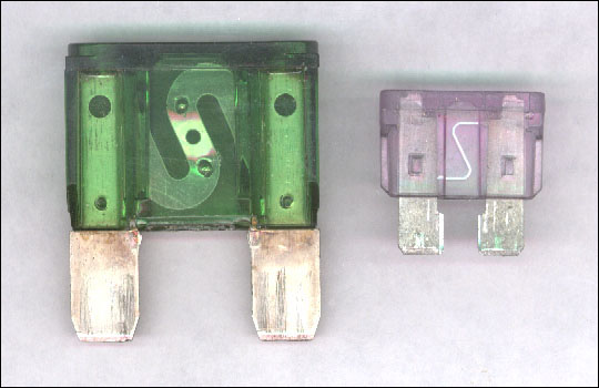
Hey Ralf, what if you incorporated the slanted "S" shape that you find commonly in standard fuses in your logo? You could have the "S" glowing and sending lighting or electricity to the other letters.

The "S" could also be your Nike swoosh.

I would take a shot at making you a logo if I had better software.

Image
Tikker
NT Legend
NT Legend
Posts: 14294
Joined: Tue Mar 09, 2004 5:22 pm

Post by Tikker »

Dylan wrote:
Tikker wrote:yes, the rest of the world spells it wrong


Check and Cheque is a prime example of the recent trind of the world, more and more magazines and newspapers (printers in general) are choosing the shorter version of words to save ink, so I'll bet that Cheque will die out before Check does =)


only in the states
User avatar
Captain Insano
Nappy Headed Ho
Nappy Headed Ho
Posts: 8368
Joined: Fri Apr 16, 2004 1:04 pm
Location: SoCal

Post by Captain Insano »

Griever wrote:Hey Ralf, what if you incorporated the slanted "S" shape that you find commonly in standard fuses in your logo? You could have the "S" glowing and sending lighting or electricity to the other letters.

The "S" could also be your Nike swoosh.

I would take a shot at making you a logo if I had better software.

Image


that is a really great idea! Maeya is almost done with the logo as it stands now but I think I might incorporate that in a later revision.

Tossica: No, you're gay because you suck on cocks.

Darcler:
Get rid of the pictures of the goofy looking white guy. That opens two right there.

Mazzletoffarado: That's me fucktard
Vivalicious wrote:Lots of females don't want you to put your penis in their mouths. Some prefer it in their ass.
Griever
NT Veteran
NT Veteran
Posts: 1283
Joined: Fri Apr 02, 2004 8:34 am
Location: Northern Virginia

Post by Griever »

captain_insano wrote:
Griever wrote:Hey Ralf, what if you incorporated the slanted "S" shape that you find commonly in standard fuses in your logo? You could have the "S" glowing and sending lighting or electricity to the other letters.

The "S" could also be your Nike swoosh.

I would take a shot at making you a logo if I had better software.

Image


that is a really great idea! Maeya is almost done with the logo as it stands now but I think I might incorporate that in a later revision.


I accept checks and paypal npnp~
User avatar
Drem
Nappy Headed Ho
Nappy Headed Ho
Posts: 8902
Joined: Mon Mar 15, 2004 3:02 pm

Post by Drem »

i think griever's idea is a lot more unique. that big shiny letter deal is a pretty boring graphic design and when i typed "fuse logo" in google images i saw a few with the S connected to other letters, similar metallic letters, etc....

i went into school for graphic design originally and just as constructive criticism i'd honestly say that the fuse design in shiny letters with lightning and shit is not a very marketable image. not to mention the silver on black scheme and shiny letters feels really akin to ATI's label designs
User avatar
labbats
Mr. Ed
Mr. Ed
Posts: 3597
Joined: Thu Mar 11, 2004 10:21 am

Post by labbats »

Show a 3-D picture of an orange extension cord plugging into itself, with the male/female connection about to connect covering most of the front and the wire running behind it, much like a snake eating itself with a space background. Throw the necessary lightning bolts in the center for effect and rake in millions.
Post Reply